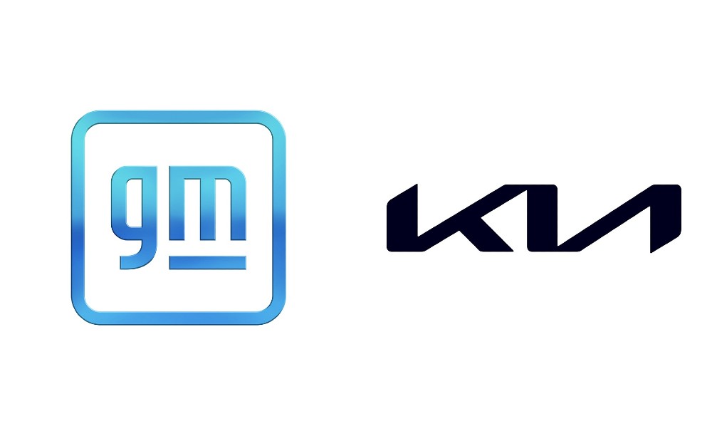
The logo of a car company is seen everywhere that company does business. GM and Kia both have new logos; which one is the better of the two.
Do we like the way that GM has changed the look or what Kia had done? Let’s take a look at these two logos and decide which one is better, or if we happen to like or dislike them both equally.
The New GM Logo
General Motors has been in business for 113 years and has been one of the most highly recognized brands in the automotive market. Although the vehicles that come out of the GM factories wear badges that aren’t the same as GM, you will see the new logo in some areas of the cars, trucks, and SUVs that are produced by this company.
The new logo for GM is a square shape, which is what we’ve seen before, the corners of the square are rounded and the color is a blue that’s darker across the middle. All of this sounds pretty normal, but what isn’t is the fact that the lettering is now in lower case. GM has changed to a softly curved font that is expected to allow the logo to feel more inclusive and modern in its design. There is an underline for the “m” but not for the “g” which might seem odd, but it does look simple and professional.
The New Kia Logo
Every vehicle that comes out of the Kia factories will wear the new Kia badge. Unlike GM, Kia vehicles showcase the logo and that means we need to see something that’s easy to admire and recognize. The current logo was simple with KIA spelled out in an oval, but this new logo is a serious departure from the norm.
The new Kia logo is letting that’s linked together in a bold and blockish manner. In fact, the “I” and “A” are so futuristic that they look like a backward “N” next to the K, which may or may not be on purpose. This new badge is attractive and sporty, which may signify the direction that Kia is heading with some of the amazing new models that are coming from this brand.
Kia and GM have New Taglines to Go with the Logos
With the push for electrification and the use of the new Ultium batter tech, GM is looking for a way to connect with the modern customer. The new tagline for this brand is “Everybody in” which is another way the brand is trying to be more inclusive and inviting for all drivers.
The new slogan for Kia is “Movement that inspires” which does go right along with the new logo to give you a different look that just might inspire your drive and offer you the pleasure you want when you’re out on the road.
Which logo and tagline do you like the most? Do you like either one or dislike them both? These are the logos and taglines we’re going to live with for the next few years as we try and see if either company can live up to their new slogans.
This post may contain affiliate links. Meaning a commission is given should you decide to make a purchase through these links, at no cost to you. All products shown are researched and tested to give an accurate review for you.
